How to Get More Uber Eats Orders With Better Food Photos

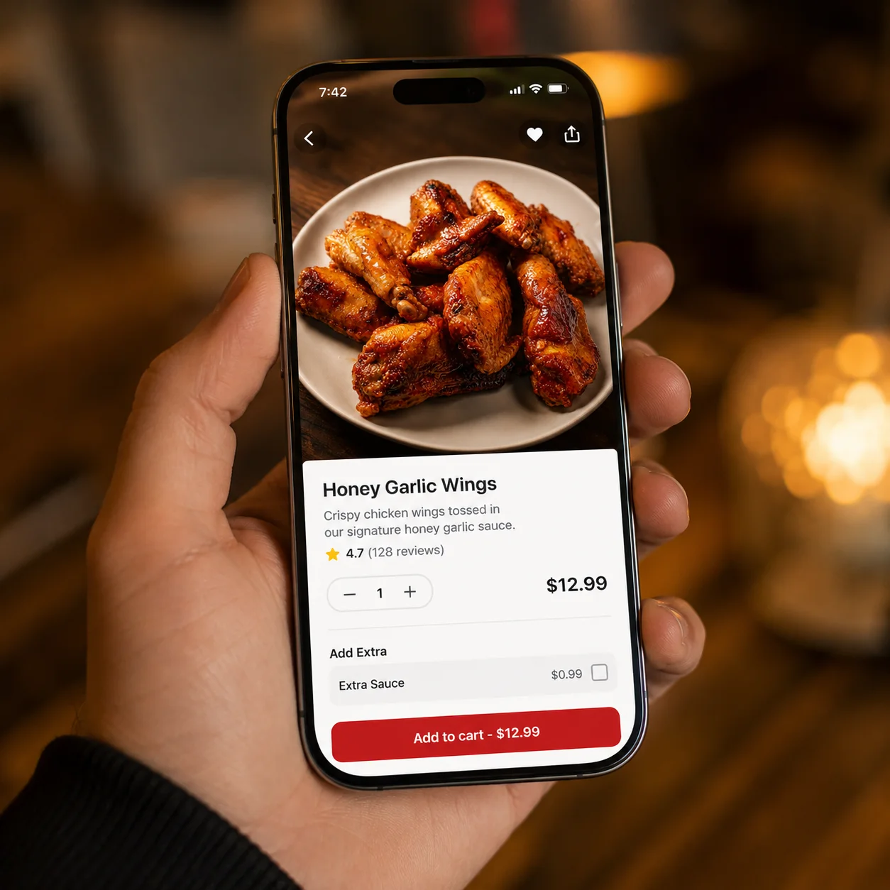
It's 6:40 on a Friday night, the time slot that used to carry your whole week, and the Uber Eats Manager app on the counter says four orders since noon. You've checked your prices twice. You've read the reviews again, looking for the sentence that explains it, and found nothing new. If you're wondering how to get more Uber Eats orders and you've already ruled out price and reviews, there's a good chance nobody with an empty stomach and thirty seconds to decide is even seeing your food the way you see it.
Why Uber Eats Rewards Photos More Than You Think
Picture the customer who opens Uber Eats at 6:40 that same Friday. They're hungry, they have somewhere to be in an hour, and they have not decided what they want yet. What they get is a grid: rows of small square tiles, one restaurant or one dish after another, scrolling past under their thumb faster than they could read a single menu description even if they tried.
That grid is the entire game. Before a customer reads your name, before they see your star rating, before they notice you're four minutes closer than the place next door, they have already made a snap judgment based on one thing: does this tile look like something I want to eat right now.
Uber Eats didn't design the app this way by accident. The category pages, the "Popular near you" rows, the featured spots that go to listings with strong click-through rates, all of it is built around visual scanning, not reading. A restaurant with a flat, dim, or confusing photo isn't losing the sale after the tap. It's losing the sale before the tap ever happens, which means the order was never really lost. It was never won in the first place.
This is why price cuts and promotions can underperform even when they should work. A ten percent discount does nothing for a listing nobody stops scrolling to look at. The photo is the gate. Everything else, including the deal you're running, only gets evaluated by customers who already decided your tile was worth a second look.
What Makes a Menu Photo Work on Uber Eats Specifically
Here's the detail most restaurant owners never think about: almost nobody sees your menu photos at full size. Uber Eats compresses every image down into a small tile for the grid and an even smaller one for category browsing. A photo can look completely fine on your phone, full screen, in your hand. Shrink that same photo to the size of a postage stamp on someone else's screen and detail disappears, colors flatten, and shadows turn into a smear of brown or gray. What survives that shrink is not the same as what survives a nice-looking photo. It's a much narrower set of things: one clear subject, strong separation between the food and the background, and enough contrast that the shape of the dish reads instantly.
Take a plate of street tacos. Photographed on a matching beige plate under a dim pendant light, the tortillas, the plate, and the table can all blur into one tan smear at tile size. Put those same tacos on a dark plate with the lime wedge and cilantro catching real light, and the tile reads clearly even shrunk down to nothing: color, texture, three distinct tacos a thumb can recognize in half a second.
A sandwich has the opposite problem. Cut in half and stacked, it can look like a wall of bread from directly overhead, no filling visible, nothing for the eye to land on. Angled slightly with the cut side facing the camera so the layers show, that same sandwich becomes instantly readable, even tiny.
A rice bowl with everything piled in the center and pushed away from the edges of the plate photographs as one indistinct mound. Spread the components so the rice, the protein, and the vegetables each hold their own visible section, and the tile shows variety and freshness instead of a single brown blob.
And a soup is maybe the hardest category on the platform, because a bowl of broth photographed straight down under weak light reads as an empty gray circle. Shot at a slight angle with the steam visible and the toppings, the noodles, the herbs, the protein, arranged so they break the surface, that same bowl suddenly looks like something worth ordering on a cold night.
None of this is about hiring a photographer or owning nice dishware. It's about understanding what a photo has to survive to still work at the size a hungry customer actually sees it.
The Uber Eats Photo Mistakes That Are Costing You Orders
A few specific habits show up again and again on underperforming Uber Eats listings, and most restaurant owners have no idea they're doing them.
Uploading landscape photos and letting the app crop them. Uber Eats tiles are square. A wide landscape shot taken on a phone held sideways gets cropped down to the center, which often slices off half the dish, half a person's hand, or the one detail that made the photo worth using in the first place. If you didn't compose the shot with a square crop in mind, the app is making that decision for you, and it's rarely a good one.
Reusing one photo across several menu items. This usually happens on setup day, when there are forty items to list and not enough time. A single "combo plate" photo gets attached to three different combo listings that actually look nothing alike in person. Customers who order based on that photo and receive something different are less likely to reorder, and worse, less likely to trust any photo on your menu going forward.
Leaving the cover photo as a placeholder. The cover photo is the largest image on your entire Uber Eats listing, the first thing a customer sees when they land on your page after tapping in from the grid, and most restaurants never touch it. It's still the default stock interior shot from setup, or a logo, or nothing at all.
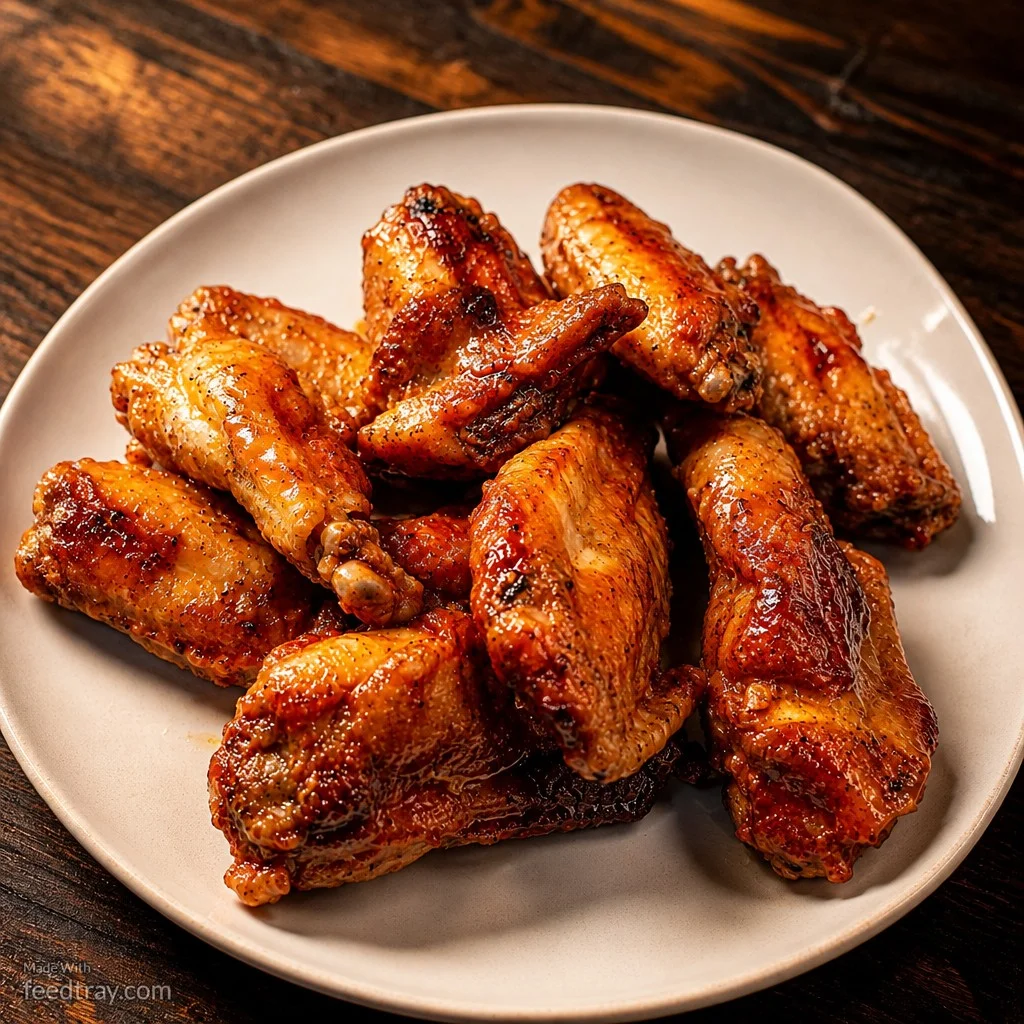
That's the single biggest piece of visual real estate on your storefront going completely unused at the exact moment a customer is deciding whether to keep browsing your Uber Eats menu or bounce back to the grid.
Never updating photos when the dish changes. Menus evolve. Portions get plated differently, a new chef changes the presentation, a seasonal special replaces last year's version. The photo from eighteen months ago is still sitting there, quietly promising a dish that no longer exists, and creating a mismatch the customer notices the second the order arrives.
Shooting everything under the kitchen's overhead lighting. Commercial kitchen lighting is built for food safety and workflow, not photography. It tends to cast a flat yellow or greenish tone across everything, which is fine to the eye in person and genuinely unappetizing once compressed into a small, color-flattened tile.
Simple Fixes That Move the Needle on Uber Eats Orders
You don't need a shoot day to fix most of this.
Start with the cover photo, since it's the single most valuable image on your listing and the easiest one to forget. Pick your best-looking, best-selling dish and make sure it's the first thing customers see, not a stock photo from setup.
Reshoot anything that's currently landscape with a square crop in mind, or crop it yourself before uploading so you control what gets cut instead of letting the algorithm decide.
Walk your photos against your actual current menu once a season and pull anything that no longer matches what leaves the kitchen. A quick swap now is cheaper than the refund or the bad review later.
Separate any item that's currently sharing a photo with another dish. Even a five-minute reshoot on your phone, angled correctly and lit from a window instead of the overhead fixture, will outperform a duplicate.
And think in tiles, not full screens, while you shoot. Hold your phone at arm's length after taking the photo and see if the dish still reads clearly. If it turns into mush that small, it will turn into mush in the grid too.
None of this is a hunch. Uber's own merchant data shows that merchants who had photos and descriptions on at least 70 percent of their menu within their first week earned an average of $330 more per week than merchants who didn't, and that gap in Uber Eats orders shows up fast once the photos are fixed.
What the Difference Actually Looks Like on Uber Eats
The gap between a photo that loses the tap and one that earns it isn't subtle once you see the two side by side. Same dish, same kitchen, same phone. What changes is what the photo does once it's shrunk down to thumbnail size, which is the only size that matters on Uber Eats.
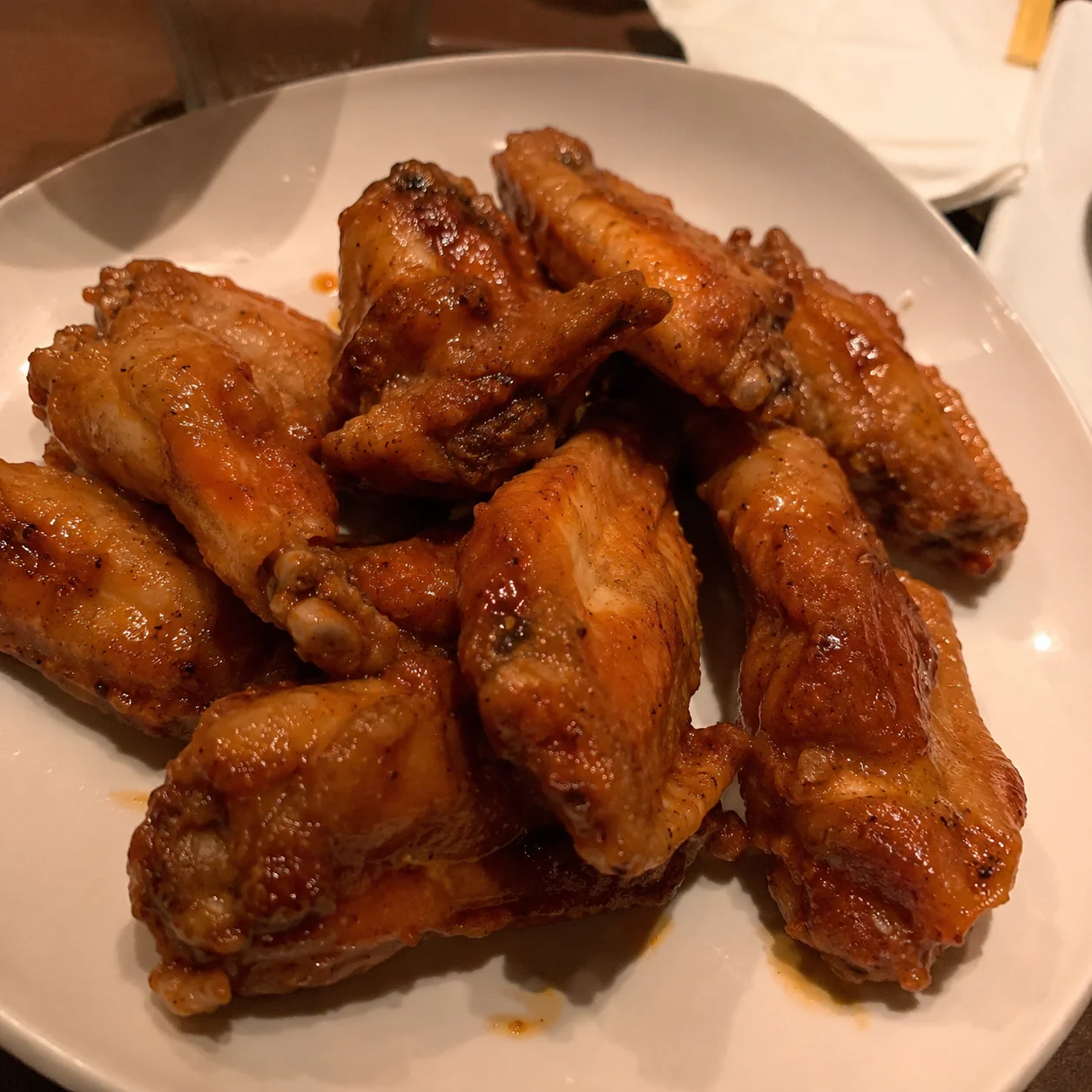
Before and after comparison of a restaurant food photo enhanced with Feedtray to get more Uber Eats orders
That difference, the glaze catching light instead of disappearing into a dim stainless background, is the difference between a listing that gets scrolled past and one that gets tapped.
The Fastest Way to Update Every Photo on Your Uber Eats Menu
Feedtray was built for exactly this problem. Upload the phone photos you already have, even ones shot in bad kitchen light on a busy afternoon, and Feedtray hands back versions with fixed lighting, color, and background in minutes, no photographer or shoot day required. The same enhanced photos work across your DoorDash menu and your social media content, so one session fixes multiple platforms at once.
Every week your Uber Eats listing runs on photos that don't survive the thumbnail is a week of orders that never got a chance to happen, and full commission still coming out of whatever revenue does come through. That's not a pricing problem or a review problem, and no promotion fixes it, because the photo is what decides whether a customer even gets far enough to see the price or the reviews at all. Fix the photo, and everything downstream of it, the taps, the menu views, the orders, gets a fair shot.